
Sending your customers to functional, and easy-to-use homepage often viewed by banks and credit unions as one of the main elements of a great marketing and website design strategy.
In our today’s blog post, we shall analyze the benefits that the banks can receive by using the landing page on their websites. We shall provide you with the research that has been recently made by Murmur team.
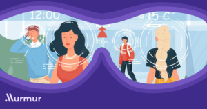
By using Murmur Lumen (Predictive Eye Tracking),the team compared the landing pages of Unibank (Azerbaijan) and Bank of America (USA).
What is a landing page?
A landing page is the first page that a visitor sees when they ‘land’ on a certain website. As opposed to homepages,landing pages offer the opportunity for customization based on the purpose of a specific campaign or market segment. Landing pages set to encourage customers to take the desired action. In other words, landing pages help limit distractions and direct visitors to take a desired next step, most often with the purpose of driving conversions.
Ways of creating effective landing pages step by step
Simplicity comes first
Don’t fill a page with too many images—it increases the chances of visitors bouncing off the page before taking action. Instead, banks should stick with concise, clear messaging, easy-to-follow directives, strong calls to action, and impactful design elements.
It’s all about Customization
By following the customized templates of the brand , the banks keep a consistent style. By using Murmur Ads , banks can try A/B testing method in order to see which template gets more feedbacks and views from the current and potential customers.
CTA (Call To Action) is a Must
Instead of writing a long copy and adding all kinds of elements to your landing page, focus on the CTA. Eventually, the goal of the landing page is to make bank visitors take action. No matter what the action is to apply for a loan, create an online account, or get information on their nearest branch, the CTA needs to be clear. Moreover, it’s good to add multiple call-to-action elements to the bank’s landing page and point its visitors in the right direction.
Mobile Version of the Landing Page Matters
61% of users reported that if they didn’t find what they were looking for at a mobile site right away they would quickly move on to another one. So, if the banks don’t want to lose their potential customers they need tomake sure that the landing page of their banks’ website is – responsive.
Add the Links
Although the banks’ landing pages focus on its campaign, consider linking it to other useful pages of your bank website. These links should be more discrete, but make sure that your visitors can easily navigate to your contact page, or subscribe to newsletter.
Murmur Ads’ comparative research on the landing pages of Unibank and Bank of America
In this research we used Murmur Lumen (Predictive Eye Tracking ) to compare Unibank and Bank of America landing pages. It helped to see what part of their landing page grabs more attention and how long it takes to login the bank account.
While analyzing the landing pages of both banks, we saw that, in general, banks in Azerbaijan try to hide account login buttons on their landing pages. It affects the role of CTA (mentioned above), as the user needs to log in to the bank account in order to fully use its services. You can learn more about our research here
Important Notice
This study is only for educational purposes and help UI/UX professionals create better web pages and be more user oriented here is my linkedin post.
Sources:
https://www.banksiteservices.com/bank-website-landing-pages-2/

Perfect work you have done, this site is really cool with great info .
I wanted to thank you for this Cool content. I’ll incoporate this with the technology from salesboosterapp.com